Obviously, the main focus of my blog (and sporting life as a whole) are mainstream sports, specifically college football and basketball. However, my sport fanaticism is actually rooted in wrestling which I began to follow around the age of 5. The process of cheering on “good guys” as I called them (aka babyfaces) and cheering against “bad guys” (heels) prepared me for a life of boisterously cheering for and against various teams. Now, my eight year old son is going through his own “wrestling phase”, and in honor of the Bad Blood Premium Live Event that we are attending together in Atlanta, I am publishing a series of wrestling rankings on this blog. The second of these columns is a ranking of the greatest Wrestlemania logos of all-time. This is a project my son wanted to take on because not only is he really into wrestling right now but he is into logos in general. Our commentary about each logo is written below each, as well as the rating out of 5 we collectively gave it (5 being the best and 1 being the worst). Please feel free to comment or debate.
1
Wrestlemania 41(2025)
Brad is glad its number is labeled but wish it had roman numerals. Both of us love the authentic Vegas design though.
4.5
———————————————————————————————————–
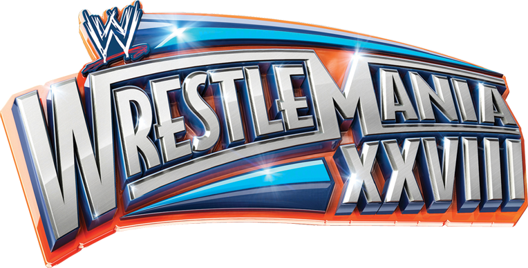
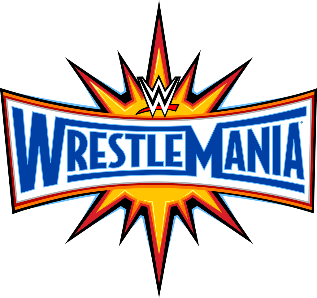
2
Wrestlemania XXVIII (2012)
Brad loves and Andrew really likes as well. Has nice Miami feel to it
4.5
———————————————————————————————————–
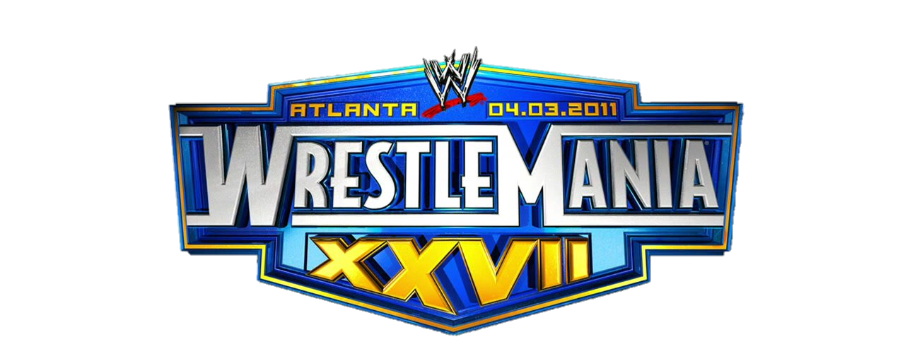
3
Wrestlemania XXVII (2011)
Brad likes colors and roman numerals, and Andrew says it needs more gold.
4.25
———————————————————————————————————–
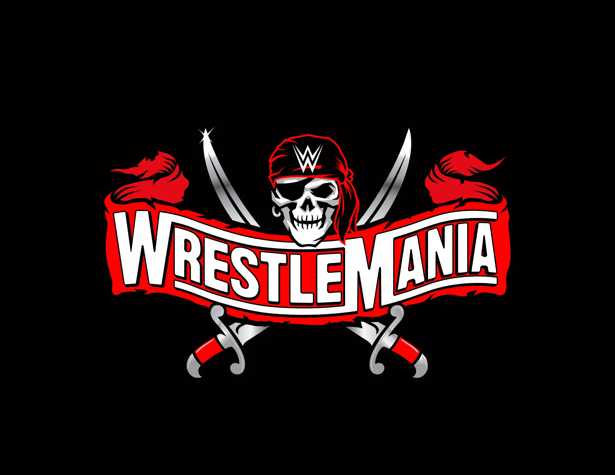
4
Wrestlemania XXXVII (2021)
Both of us think its better pirate logo from the year before, but Brad doesn’t like there is no number,
4.0
———————————————————————————————————–
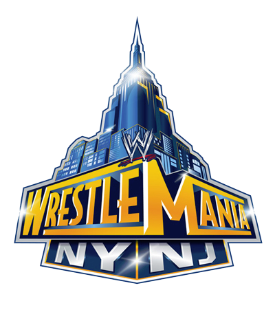
5
Wrestlemania XXIX (2013)
Andrew loves this one, but Brad doesn’t like the fact there is no number on it and the NY/NJ sub-label seems weak.
4.0
———————————————————————————————————–
6
Wrestlemania XIV (1998)
Andrew thinks its too but but would like it if it had more gold in it. I like for nostalgia reasons.
3.75
———————————————————————————————————–
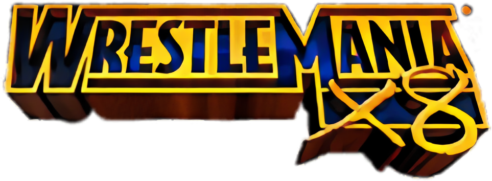
7
Wrestlemania X8 (XVIII, 2002)
Andrew ranks a 5 but Brad ranked a 2. Brad hates X8 branding and the weird writing but Andrew likes color scheme.
3.5
———————————————————————————————————–
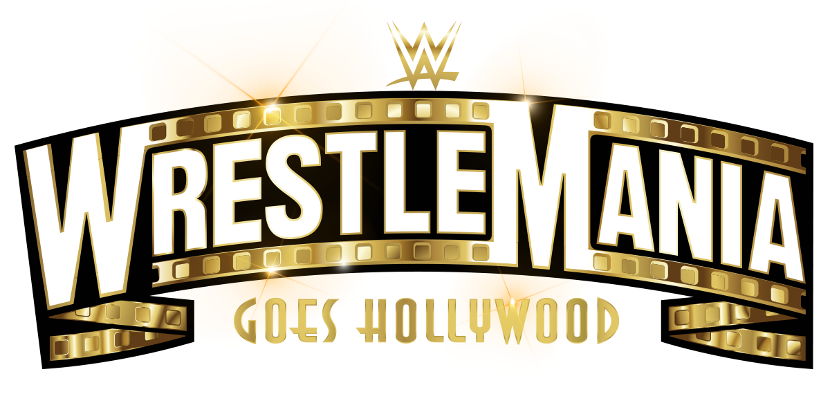
8
Wrestlemania XXXIX (2023)
Andrew thinks lettering should be gold but otherwise likes. Brad doesn’t really like because there is no number displayed and the “Goes Hollywood” branding seems cheesy.
3.5
———————————————————————————————————–
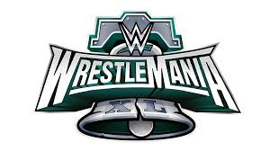
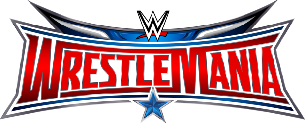
9
Wrestlemania XL (2024)
Finally a return to putting Roman Numerals on the logo! Brad likes more than Andrew.
3.5
———————————————————————————————————–
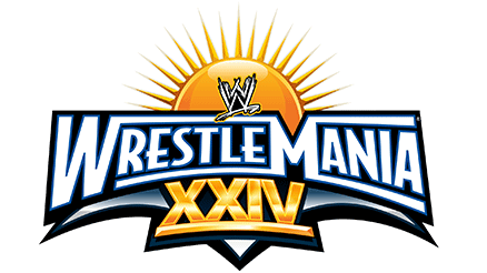
10
Wrestlemania XXIV (2008)
Brad likes the return to roman numeral use and Andrew thinks the sun in background is a nice touch.
3.5
———————————————————————————————————–
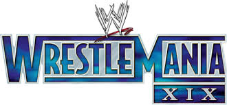
11
Wrestlemania XIX (2003)
Brad likes return to traditional look but Andrew doesn’t like the color scheme.
3.5
———————————————————————————————————–
12
Wrestlemania XXXIV (2018)
A slightly improved version of the Wrestlemania XXX but Brad wishes roman numeral or at least number was in logo.
3.25
———————————————————————————————————–
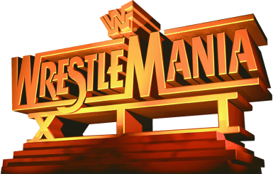
13
Wrestlemania XII (1996)
Brad thinks its a cheap copy cat rendition of 20th century Fox Logo, but Andrew thinks the gold is “glorious” and best pre-2000 Wrestlemania logo.
3.0
———————————————————————————————————–
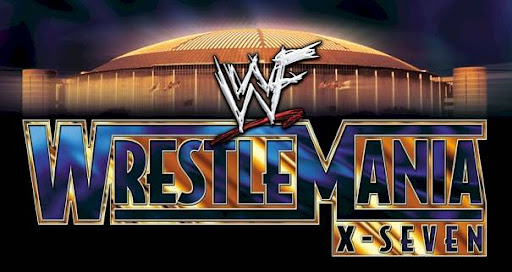
14
Wrestlemania X-Seven (XVII, 2001)
Andrew really likes, but Brad thinks the Astrodome in background looks cheesy and “X-Seven” is terrible branding.
3.0
———————————————————————————————————–
15
Wrestlemania XXXVI (2020)
Both of us like pirate theme, but Brad doesn’t like the lack of number or roman numeral in logo.
3.0
———————————————————————————————————–
16
Wrestlemania XXXII (2021)
Brad doesn’t like that there is no number but likes the color scheme. Andrew thinks it’s just ok.
3.0
———————————————————————————————————–
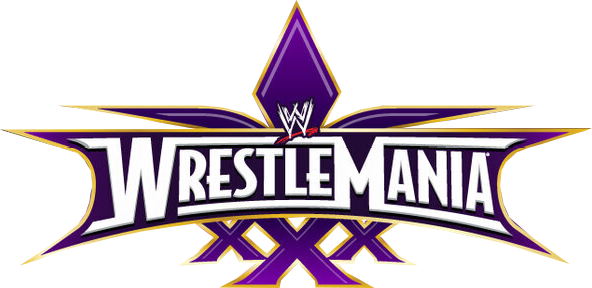
17
Wrestlemania XXX (2014)
Both of us think its just ok but Brad likes roman numeral use.
3.0
———————————————————————————————————–
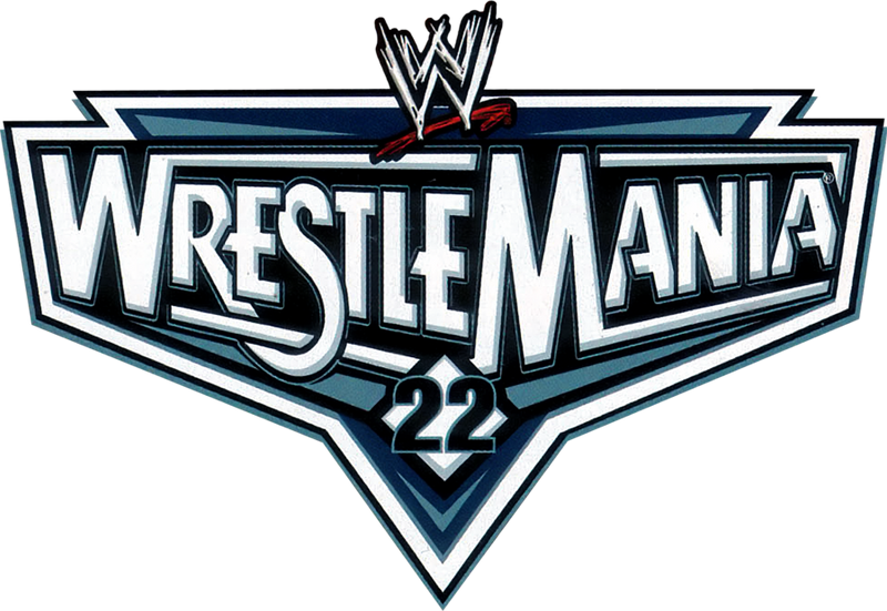
18
Wrestlemania 22 (2006)
Brad doesn’t like there is no roman numerals, but both of us think its a decent design overall.
3.0
———————————————————————————————————–
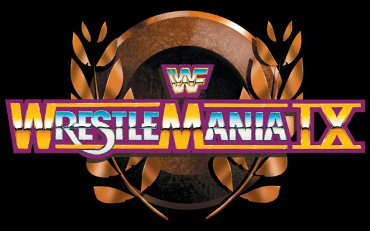
19
Wrestlemania IX (1993)
Andrew likes a lot more than the first 8. I think it is just okay
3.0
———————————————————————————————————–
20
Wrestlemania I (1985)
Brad likes the classic look and cleanness of the logo. Andrew says it is complete trash
3.0
———————————————————————————————————–
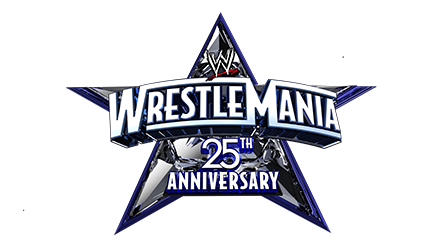
21
Wrestlemania 25 (2009)
Andrew likes logo overall, but Brad thinks the 25th Anniversary branding is silly and think its “too busy” in the middle
2.75
———————————————————————————————————–
22
Wrestlemania XXXIII (2017)
Brad thinks its a just a big yellow blob and doesn’t like the fact there is no number. Andrew kinda likes.
2.5
———————————————————————————————————–
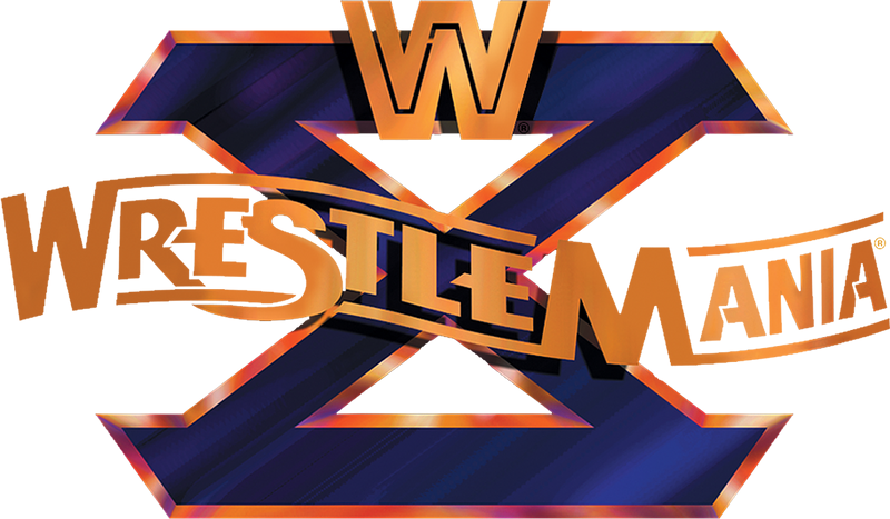
23
Wrestlemania X (1994)
Andrew likes, but Brad think it has a bad 90’s look to it.
2.5
———————————————————————————————————–
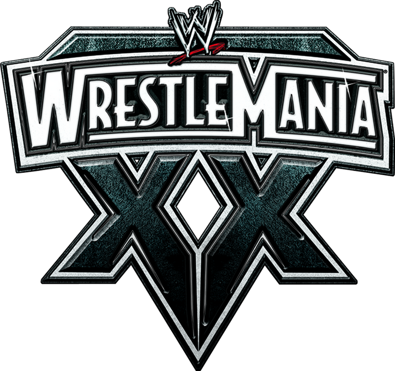
24
Wrestlemania XX (2004)
Andrew kinds likes, but I think it looks goofy. Andrew calls it the “touching tips” logo because the tips of the X’s touch.
2.5
———————————————————————————————————–
25
Wrestlemania XV (1999)
Brad thinks its plain, but Andrew think it is decent.
2.5
———————————————————————————————————–
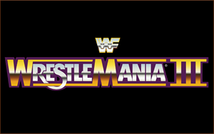
T-26
Wrestlemania III (1987)
Very similar logo to Wrestlemania I but Brad doesn’t like purple background as much as the clean white on the original. However, this is the first Wrestlemania logo to feature roman numerals which we both appreciate.
2.5
———————————————————————————————————–
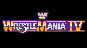
T-26
Wrestlemania IV (1988)
Same exact logo as Wrestlemania III and VI
2.5
———————————————————————————————————–
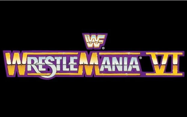
T-26
Wrestlemania VI (1990)
Same exact logo as Wrestlemania III and IV
2.5
———————————————————————————————————–
29
Wrestlemania XXXV (2019)
Neither of us like this logo very much
2.0
———————————————————————————————————–
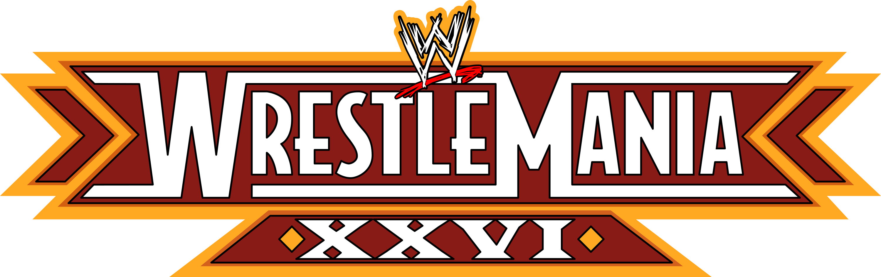
30
Wrestlemania XXVI (2010)
Andrew says it looks goofy and Brad agrees
2.0
———————————————————————————————————–
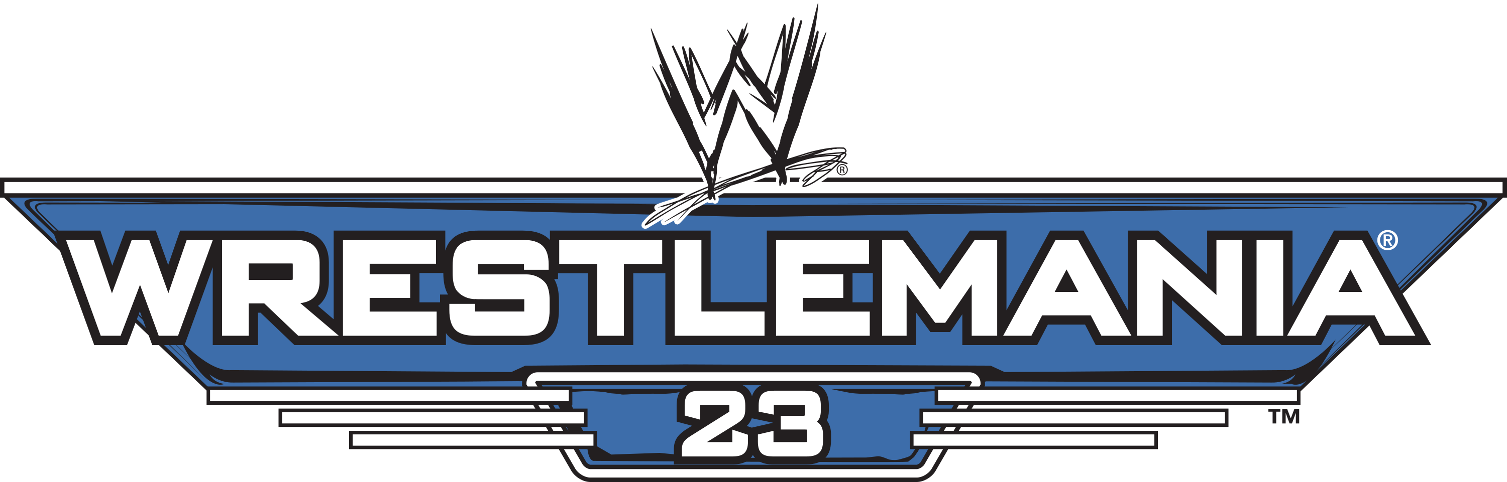
31
Wrestlemania 23 (2007)
Brad is still upset about no roman numeral and Andrew thinks it needs more color
2.0
———————————————————————————————————–
32
Wrestlemania XXXVIII (2022)
Andrew likes the shine but appears to be a big step backwards in complexity. Still doesn’t have a number which Brad is upset about.
1.5
———————————————————————————————————–
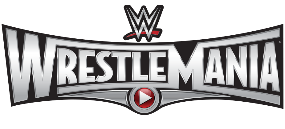
33
Wrestlemania XXXI (2015)
Andrew thinks it is okay, but Brad hates the play button design and the fact there is no roman numeral or numbers on it.
1.5
———————————————————————————————————–
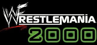
34
Wrestlemania 2000 (XVI)
Brad think its terrible but Andrew think its just bad but not horrible.
1.5
———————————————————————————————————–
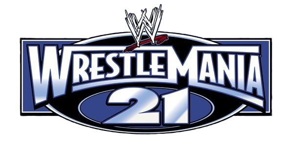
35
Wrestlemania 21 (2005)
Andrew says its trash. Brad hates that they gave up roman numerals again
1.0
———————————————————————————————————–
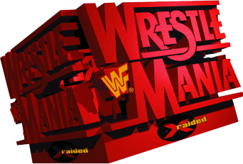
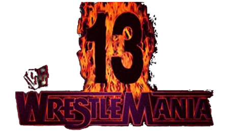
36
Wrestlemania 13 (1997)
We both despise. Brad thinks its worst logo before year 2000. Don’t have roman numeral and fire looks cheesy.
1.0
———————————————————————————————————–
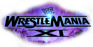
37
Wrestlemania XI (1995)
We both think its trash. Purple background is really bad.
1.0
———————————————————————————————————–
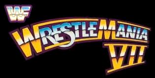
T-38
Wrestlemania VII (1991)
We both think the curved logo is goofy.
1.0
———————————————————————————————————–
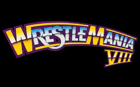
T-38
Wrestlemania VIII (1992)
Same analysis as Wrestlemania VII.
1.0
———————————————————————————————————–
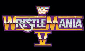
40
Wrestlemania V (1989)
We both hate the 5 being underneath the Wrestlemania logo
1.0
———————————————————————————————————–
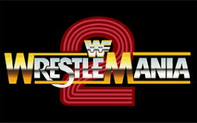
41
Wrestlemania 2 (1986)
Both of us think its complete trash. The 2 looks really goofy