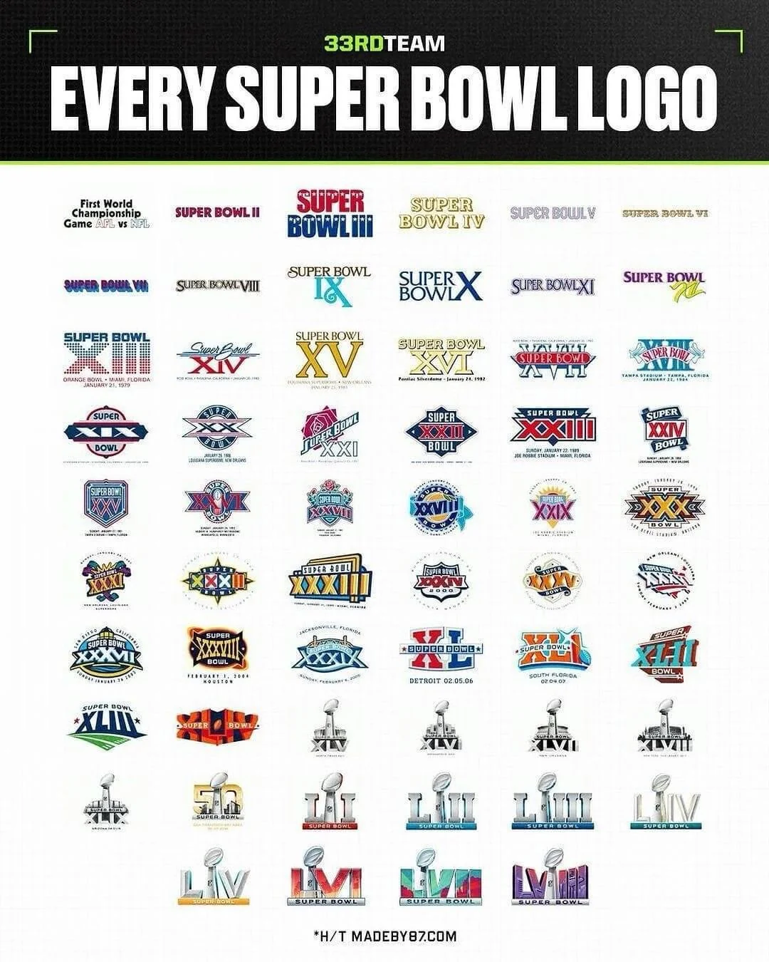
This will be the first of three Super Bowl recap articles. In past years, I have ranked both the Super Bowl halftime shows and the Super Bowl games themselves but I am adding a third Super Bowl list to the arsenal this season. My eight year old son is really into sports logos right now and as a result we spent some time this fall ranking the logos each Super Bowl has used to identify itself. We also had a third judge, CFRA member and fellow sports enthusiast Ward Coleman, help us with some these rankings. Our commentary about each logo is written below each, as well as the rating out of 5 we collectively gave it (5 being the best and 1 being the worst). Like my ranking of halftime shows, I am not sure there is another list out there on the web anywhere. Feel free to comment or debate and come back to the blog tomorrow to see my updated ranking of the greatest Super Bowl halftime shows of all-time.
1
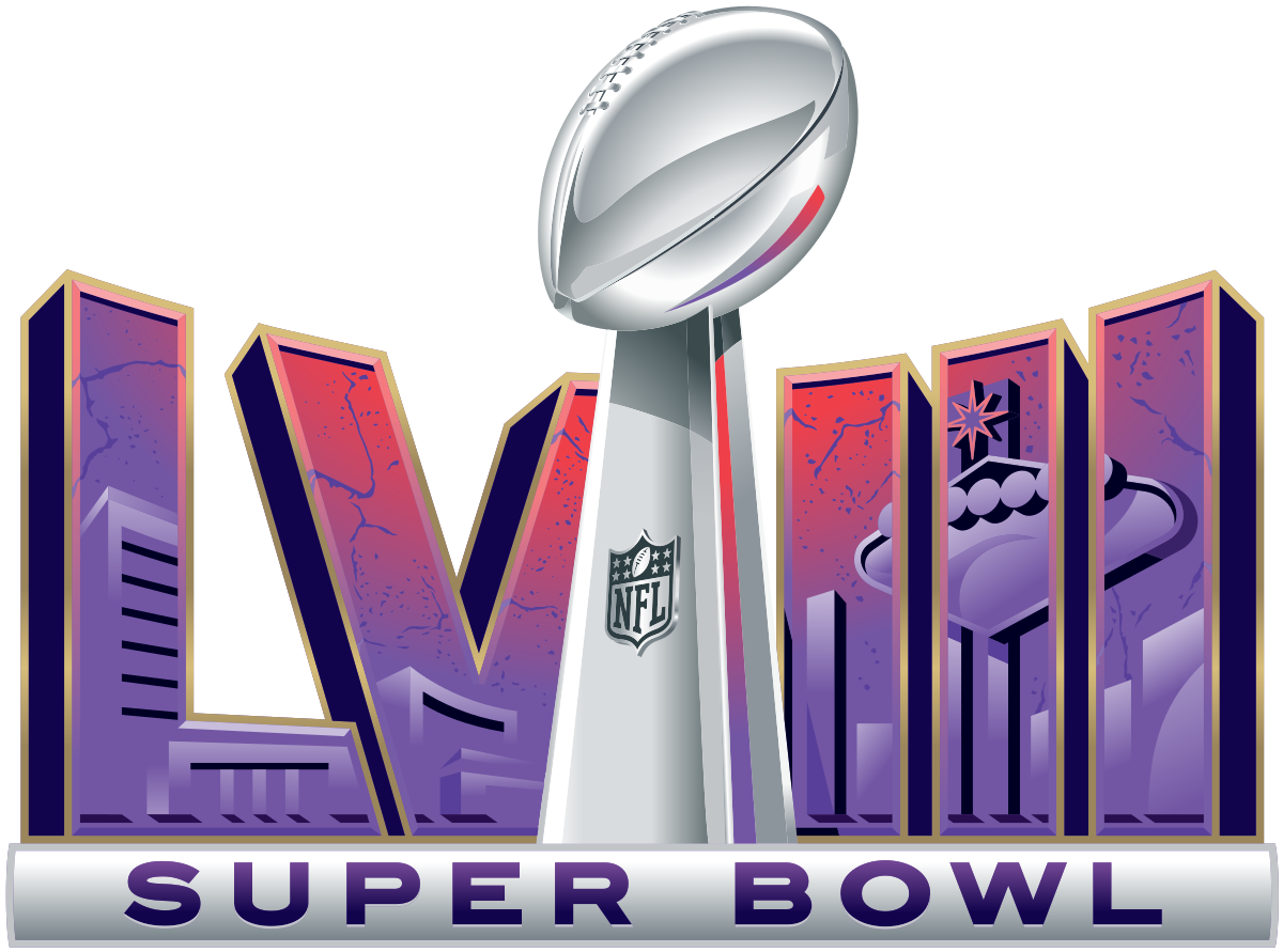
Super Bowl LVIII (2024)
Both of us like the authentic Vegas design
5.00
———————————————————————————————————–
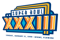
2
Super Bowl XXXIIII (1999)
Brad likes Miami Vice theme. Andrew thinks its just okay.
5.00
———————————————————————————————————–
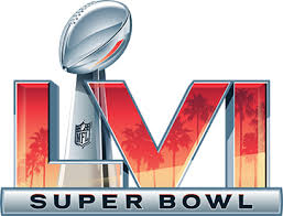
3
Super Bowl LVI (2022)
After the blandness of the logos in the late 2010’s and early 2020’s, Brad is so happy they finally added a design to it.
4.50
———————————————————————————————————–
4
Super Bowl XXXI (1997)
Brad likes authentic New Orleans design
4.25
———————————————————————————————————–
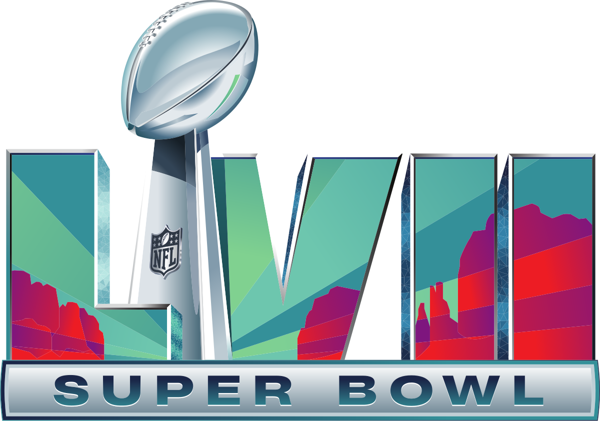
5
Super Bowl LVII (2023)
Both of us really like the background design
4.00
———————————————————————————————————–
6
Super Bowl XXXVI (2002)
Brad really likes the post-9/11 patriotism. Andrew thinks its average
4.00
———————————————————————————————————–
7
Super Bowl XIII (1979)
We both like the dot design.
4.00
———————————————————————————————————–
8
Super Bowl VII (1973)
Brad really likes the psychedlic 1970’s design like Super Bowl V. However, Andrew think its better than the Super Bowl V logo.
4.00
———————————————————————————————————–
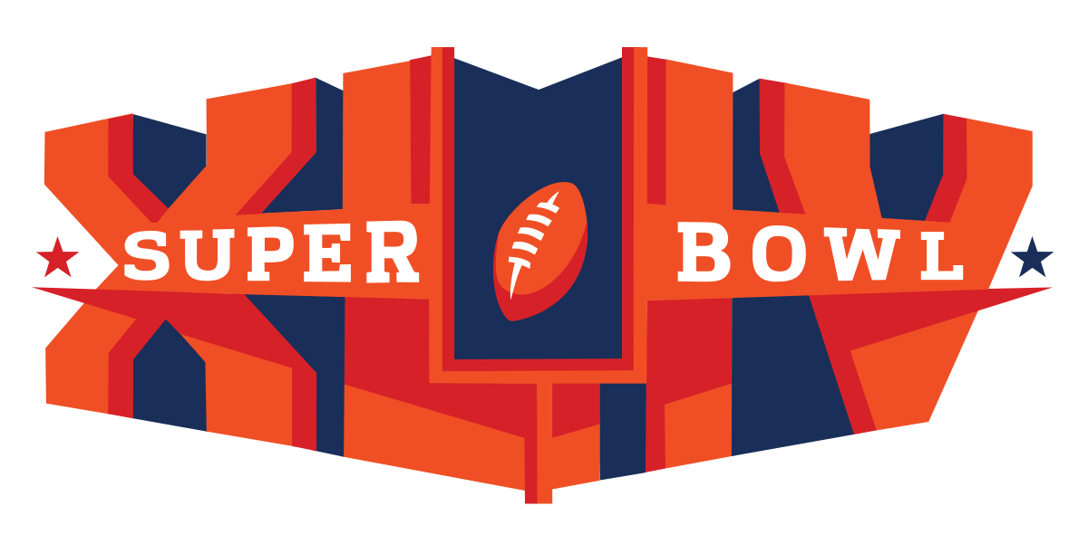
9
Super Bowl XLIV (2010)
Andrew likes the 3D effect and the orange lettering and Brad agrees
3.87
———————————————————————————————————–
10
Super Bowl XXXVII (2003)
Both of us like the neat aquatic design
3.87
———————————————————————————————————–
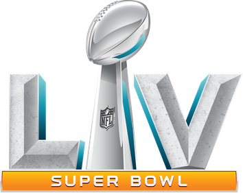
11
Super Bowl LV (2021)
Andrew likes this one more than the other standardized logos of this time period because of the color scheme
3.75
———————————————————————————————————–
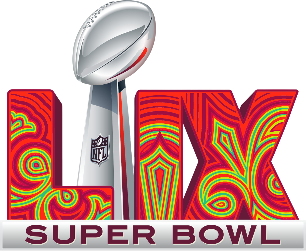
12
Super Bowl LIX (2025)
Andrew really likes but Brad thinks its too “trippy” looking.
3.75
———————————————————————————————————–
13
Super Bowl XL (2006)
Andrew likes more than Brad because of the red and blue color scheme.
3.50
———————————————————————————————————–
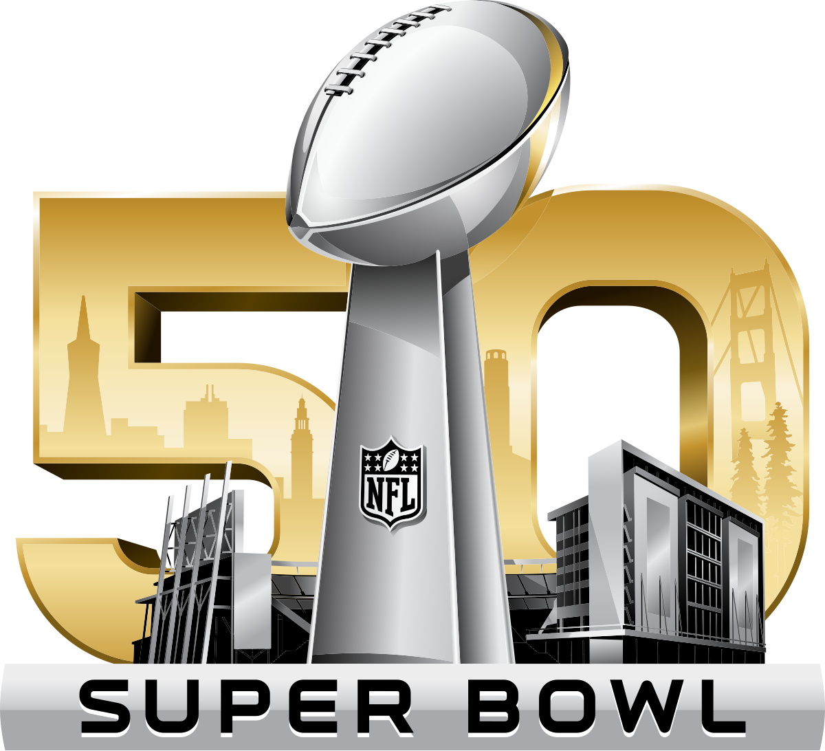
14
Super Bowl 50 (2016)
Brad doesn’t like the fact there is no roman numeral. Andrew loves the gold though
3.50
———————————————————————————————————–
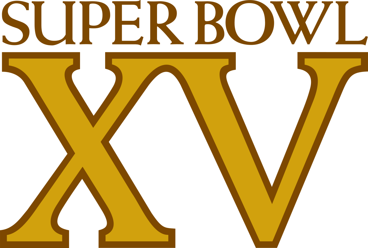
15
Super Bowl XV (1981)
Andrew likes gold and I like simplicty but Ward thik its too plain.
3.50
———————————————————————————————————–
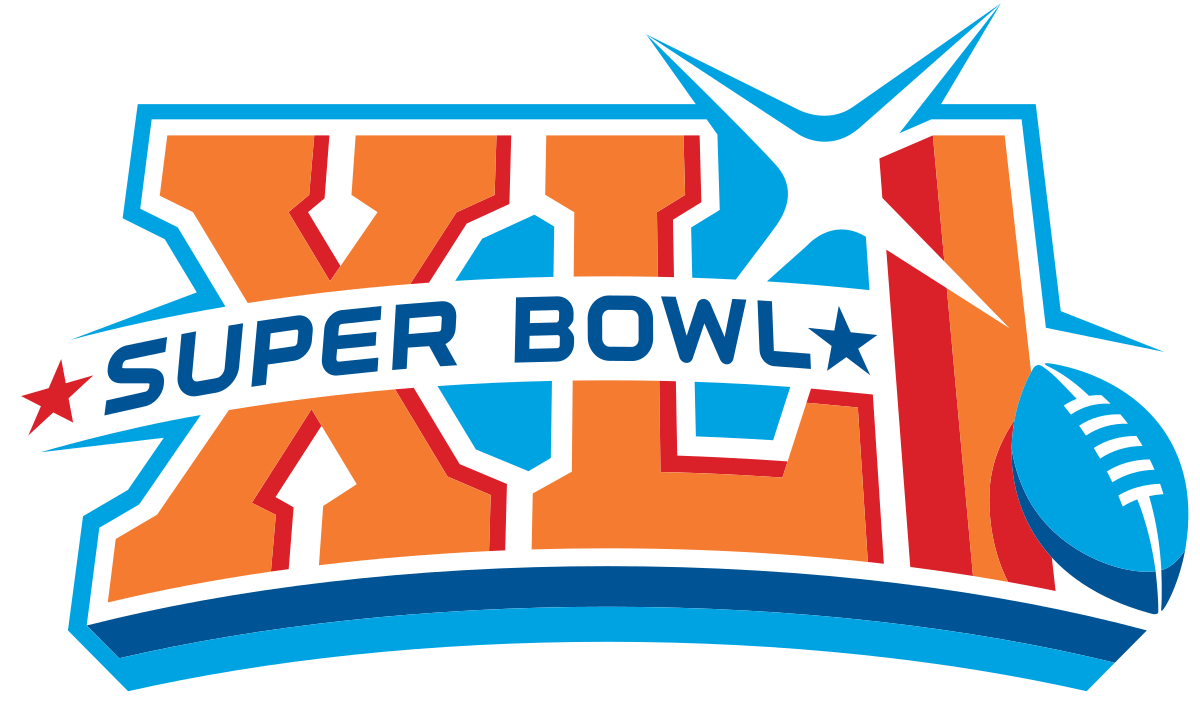
16
Super Bowl XLI (2007)
Andrew likes the orange and blue coloring and the shine.
3.50
———————————————————————————————————–
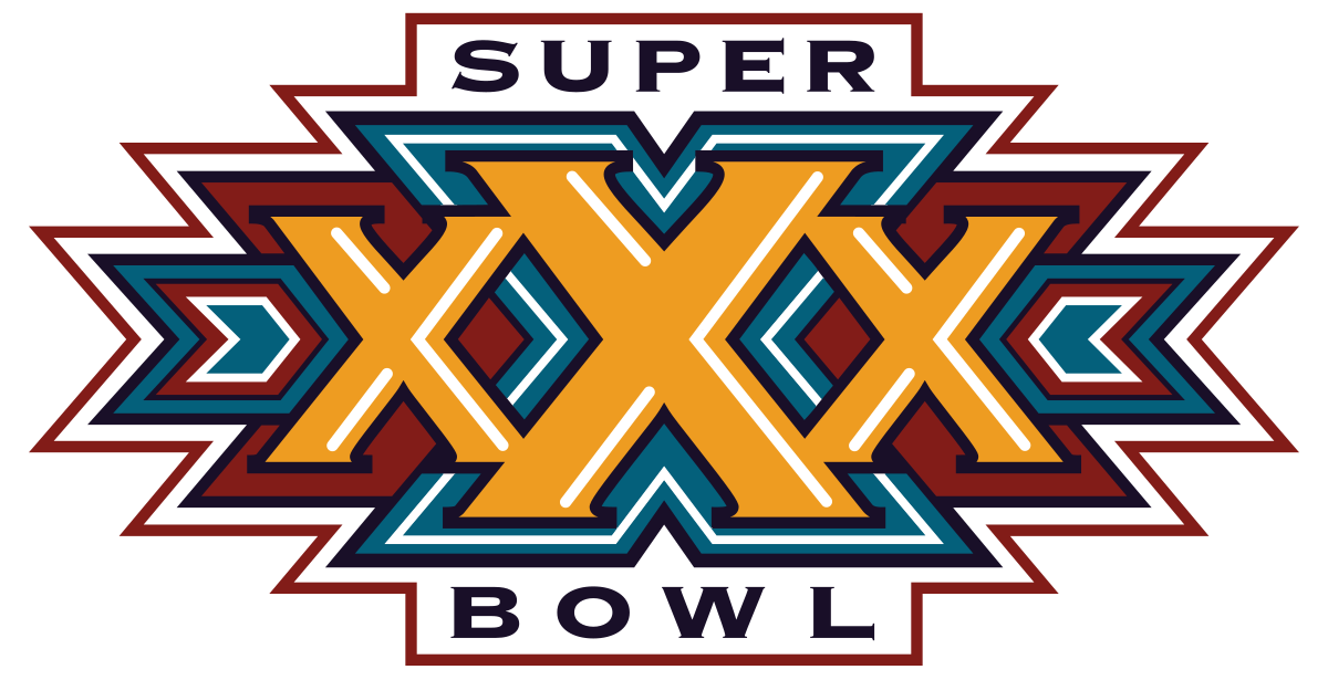
17
Super Bowl XXX (1996)
We both like the 3D effect of it.
3.50
———————————————————————————————————–
18
Super Bowl LX (2026)
Neither of us like the color scheme very much but design is cool
3.50
———————————————————————————————————–
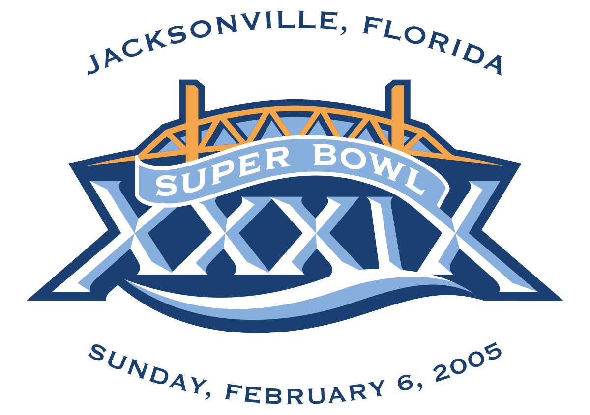
19
Super Bowl XXXIX (2005)
Brad likes more than Andrew.
3.50
———————————————————————————————————–
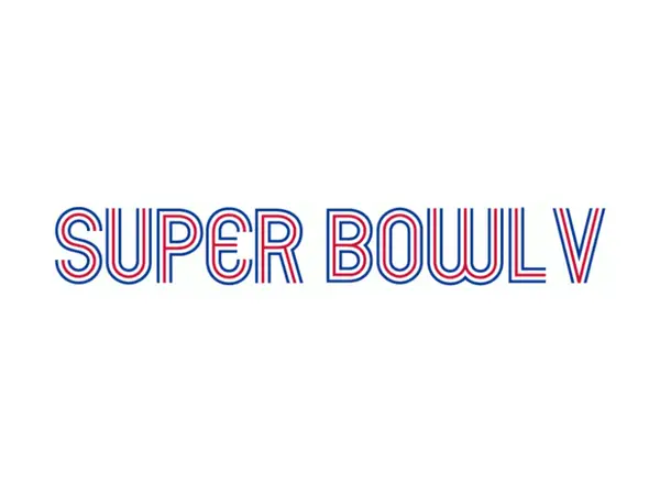
20
Super Bowl V (1971)
Brad really likes the psychedlic 1970’s design but Andrew does not.
3.37
———————————————————————————————————–
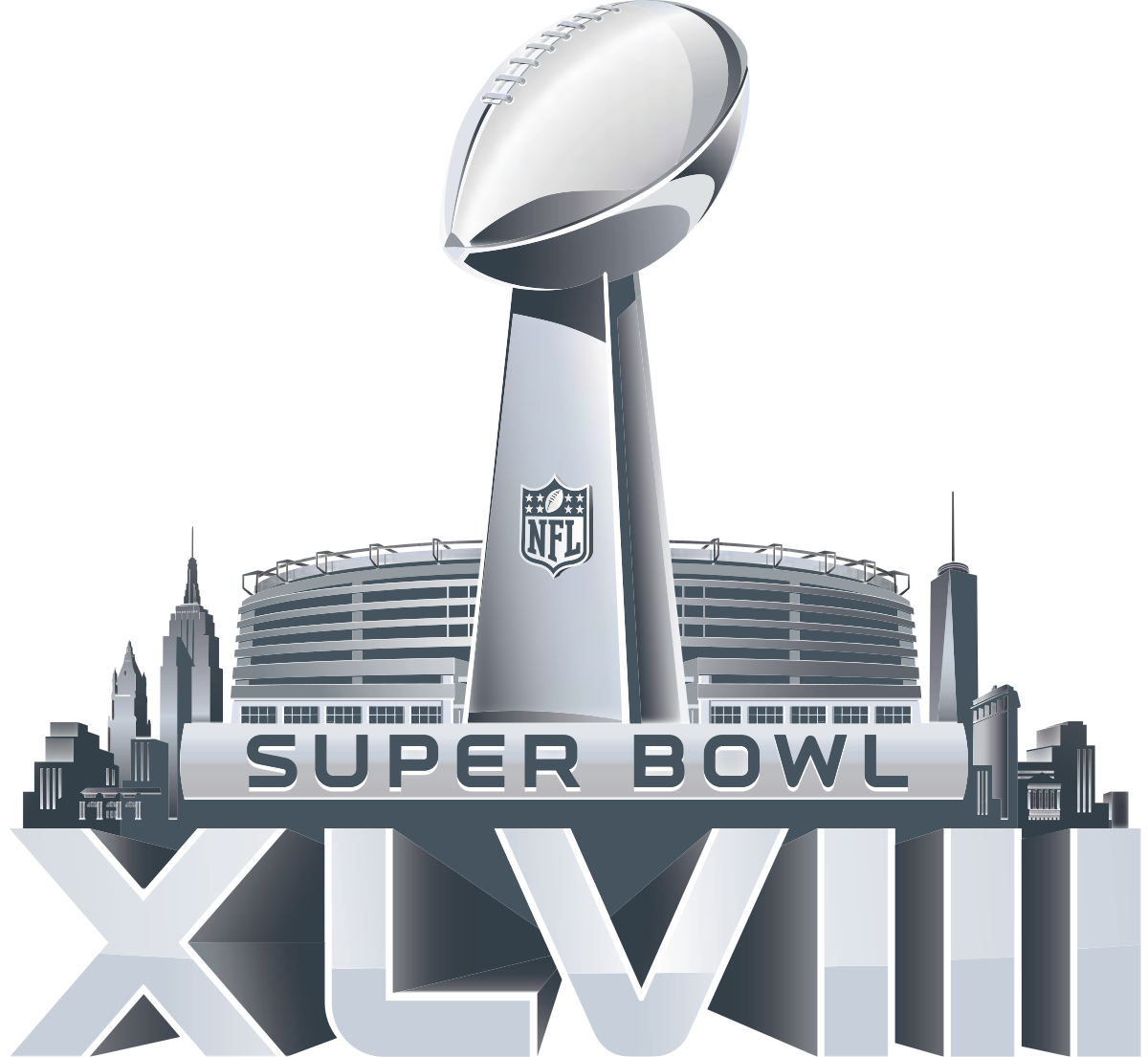
21
Super Bowl XLVIII (2014)
Brad likes the addition of the NY skyline to the basic stadium design
3.25
———————————————————————————————————–
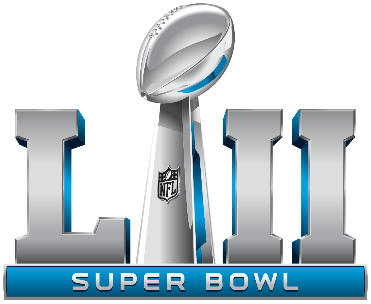
22
Super Bowl LII (2018)
Andrew likes the blue at the bottom of the logo.
3.25
———————————————————————————————————–
23
Super Bowl VI (1972)
Brad thinks its just okay. Andrew likes the gold on it.
3.25
———————————————————————————————————–
24
Super Bowl XLVI (2012)
Andrew likes the stadium background but Brad doesn’t like the move towards the same basic logo
3.25
———————————————————————————————————–
25
Super Bowl XVIII (1984)
Ward really likes the southern flair of the logo. I thik it is alright. Andrew really doesn’t like
3.20
———————————————————————————————————–
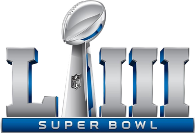
26
Super Bowl LIII (2019)
Brad hates the lack of creativity.
3.00
———————————————————————————————————–
27
Super Bowl XXVIII (1994)
Brad think its ok. Andrew likes the golden peach look.
3.00
———————————————————————————————————–
28
Super Bowl III (1969)
Much better than first two Super Bowl logos
3.00
———————————————————————————————————–
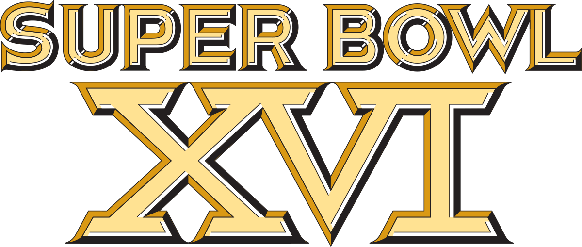
29
Super Bowl XVI (1982)
Andrew likes gold again but me and Ward think its kinda plain
3.00
———————————————————————————————————–
30
Super Bowl X (1976)
Brad likes the blue but design is kinda boring.
3.00
———————————————————————————————————–
31
Super Bowl VIII (1974)
Kinda plain design but colors are good
3.00
———————————————————————————————————–
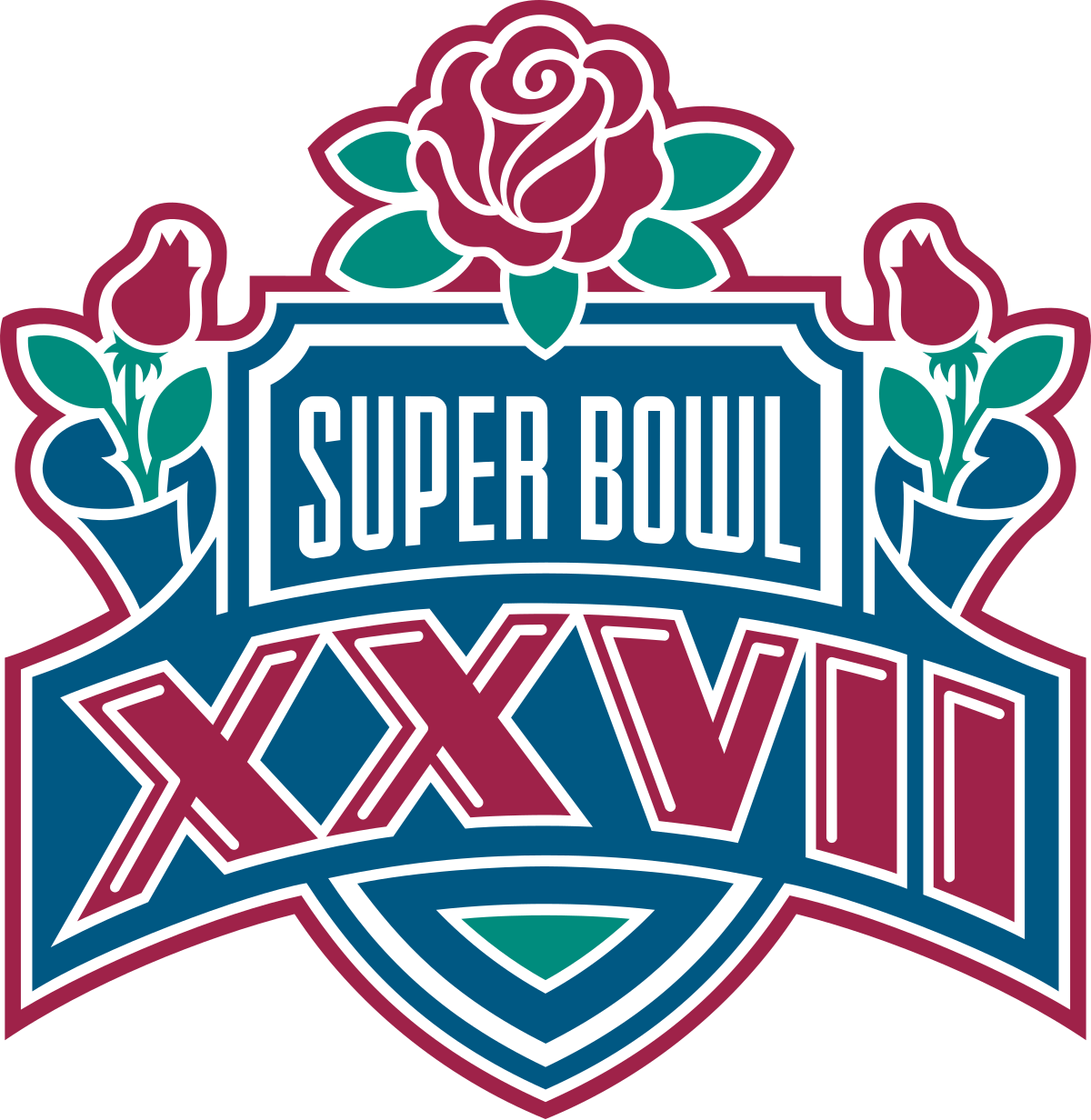
32
Super Bowl XXVII (1993)
Brad thinks too “rosy” but colors are nice.
3.00
———————————————————————————————————–
33
Super Bowl XXXII (1998)
Andrew likes the different colors. Brad think its juvenile looking
3.00
———————————————————————————————————–
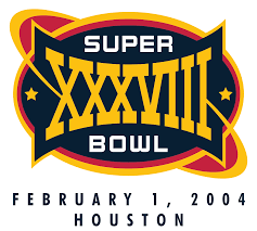
34
Super Bowl XXXVIII (2004)
Average for both of us
3.00
———————————————————————————————————–
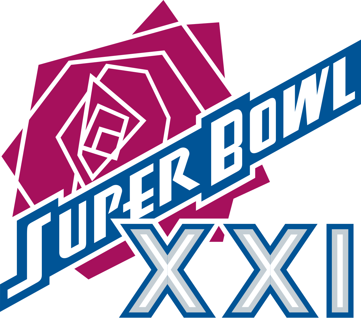
35
Super Bowl XXI (1987)
We all think its just alright.
2.93
———————————————————————————————————–
36
Super Bowl XXVI (1992)
Brad likes for nostalgia purposes but no one else did
2.87
———————————————————————————————————–
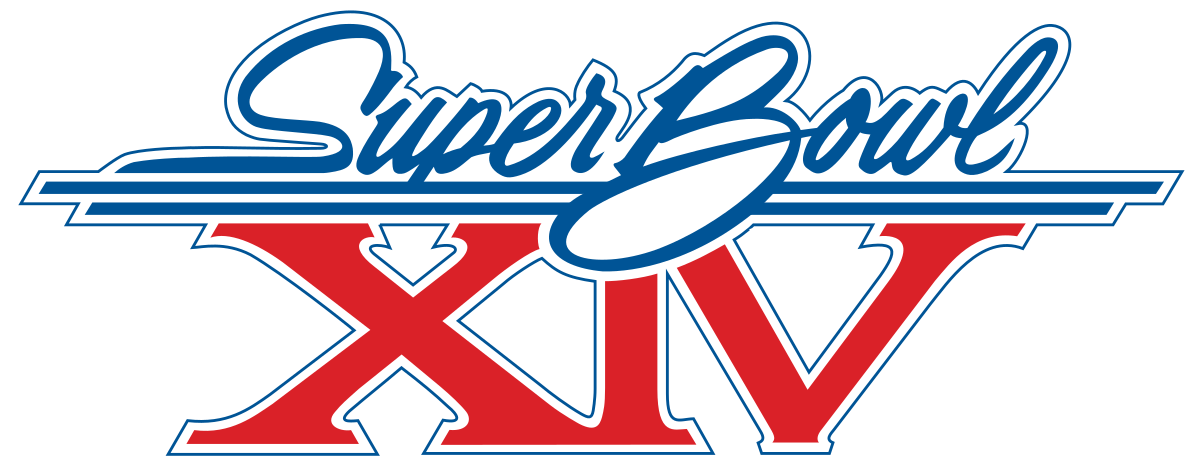
37
Super Bowl XIV (1980)
I don’t like the cursive but Andrew thinks it is decent
2.80
———————————————————————————————————–
38
Super Bowl XLVII (2013)
Andrew likes the stadium background but Brad doesn’t like the move towards the same basic logo
2.75
———————————————————————————————————–
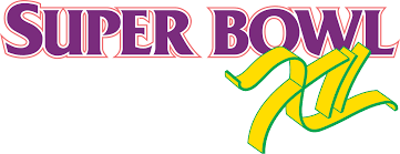
39
Super Bowl XXXIV (2000)
Andrew thinks its okay. Brad doesn’t like that much, as it seems too basic.
2.75
———————————————————————————————————–
40
Super Bowl XI (1977)
We like the colors but overall kind of boring
2.50
———————————————————————————————————–
41
Super Bowl LIV (2020)
Andrew thinks the green looks goofy and weird
2.50
———————————————————————————————————–
42
Super Bowl XLV (2011)
Brad thinks its boring and Andrew thinks it needs more gold.
2.50
———————————————————————————————————–
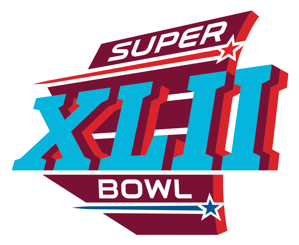
43
Super Bowl XLII (2008)
Andrew likes how the logo looks like it is flying. Brad thinks it looks cheesy.
2.50
———————————————————————————————————–
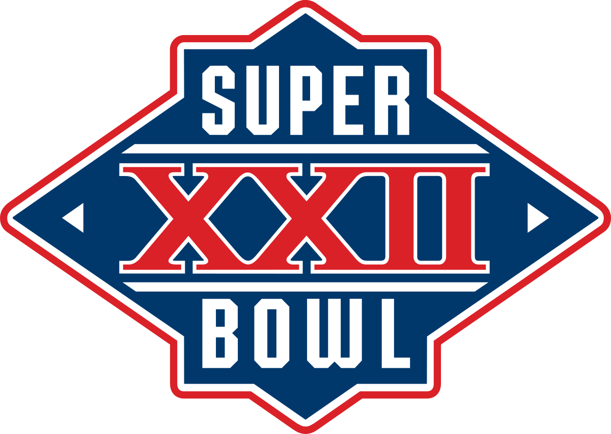
44
Super Bowl XXII (1988)
Andrew thinks this one is goofy and Ward says its too basic.
2.50
———————————————————————————————————–
45
Super Bowl XLIII (2009)
Brad thinks its too basic and Andrew agrees its below average.
2.50
———————————————————————————————————–
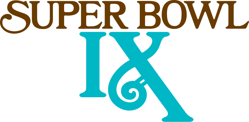
46
Super Bowl IX (1975)
Andrew thinks its okay but Brad doesn’t like colors or elongated X
2.42
———————————————————————————————————–
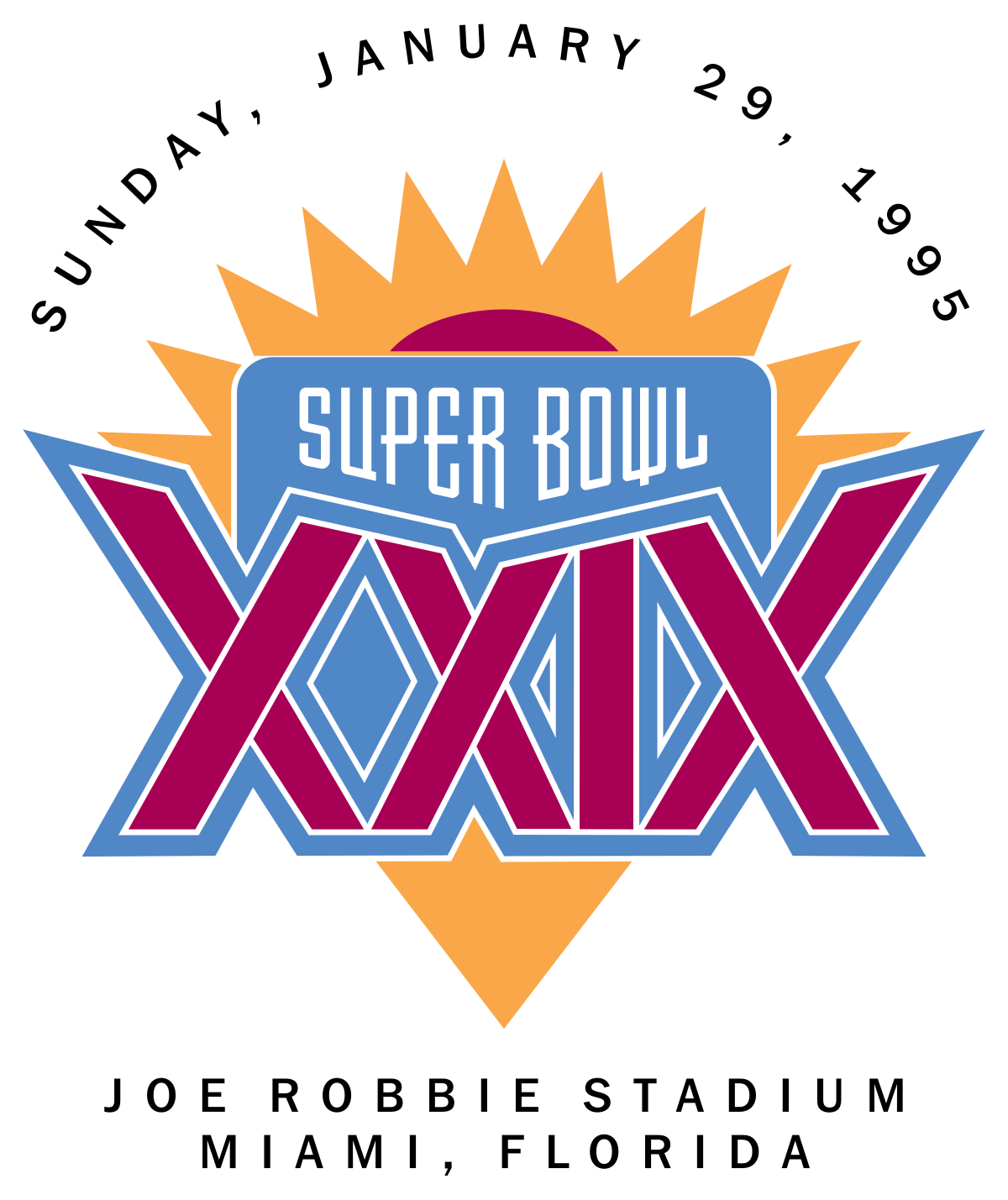
47
Super Bowl XXIX (1995)
Bad retro 90’s look but Andrew likes the gold
2.33
———————————————————————————————————–
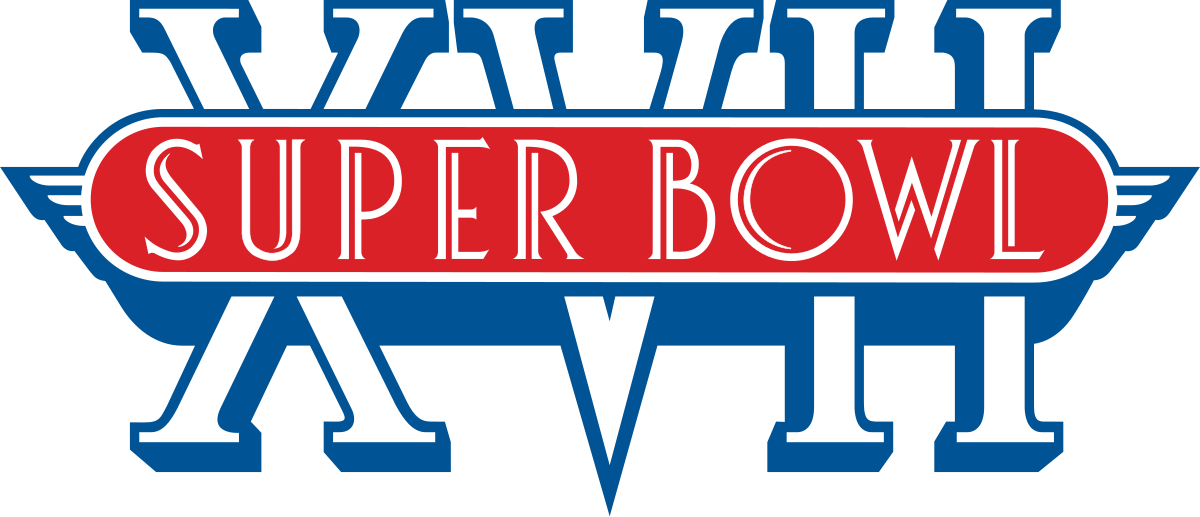
48
Super Bowl XVII (1983)
We like the fact they added some flavor too it but this one is too busy
2.33
———————————————————————————————————–
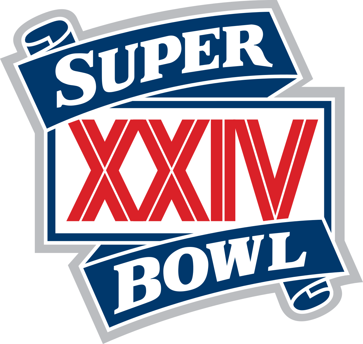
49
Super Bowl XXIV (1990)
Ward thinks it looks too much like a beer logo. I think its just alright.
2.25
———————————————————————————————————–
50
Super Bowl XII (1978)
Andrew likes the gold but Brad hates the cursive roman numeral
2.25
———————————————————————————————————–
51
Super Bowl XXIII (1989)
Very similar to Super Bowl XXII
2.00
———————————————————————————————————–
52
Super Bowl XLIX (2015)
Stadium background logos lack creativity
2.00
———————————————————————————————————–
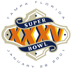
53
Super Bowl XXXV (2001)
Brad hates it but Andrew thinks its okay
2.00
———————————————————————————————————–
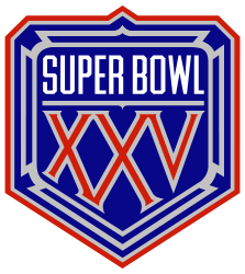
54
Super Bowl XXV (1991)
Design in middle seems weird
2.00
———————————————————————————————————–
55
Super Bowl IV (1970)
Boring and plain
2.00
———————————————————————————————————–
56
Super Bowl LI (2017)
Andrew thinks its disgusting and Brad thinks its way too basic.
1.75
———————————————————————————————————–
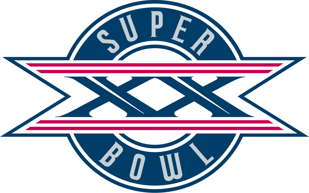
57
Super Bowl XX (1986)
Andrew says it looks goofy
1.50
———————————————————————————————————–
58
Super Bowl XIX (1985)
We both agree it looks bad
1.50
———————————————————————————————————–
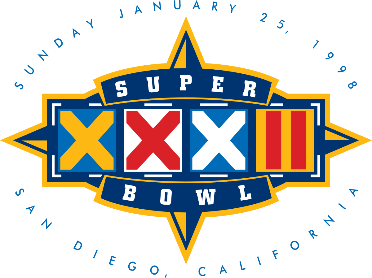
59
Super Bowl II (1968)
Really dull
1.00
———————————————————————————————————–
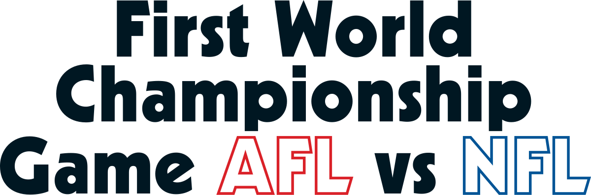
60
Super Bowl I (1967)
Makes sense for the worst Super Bowl logo to be the only one that doesn’t have the word Super Bowl on it.